By Alisa Vincentelli, Tru Vue International Museum and Conservation Liaison
‘How blind is he who can’t see through a sieve’ Miguel de Cervantes, Don Quixote de la Mancha.
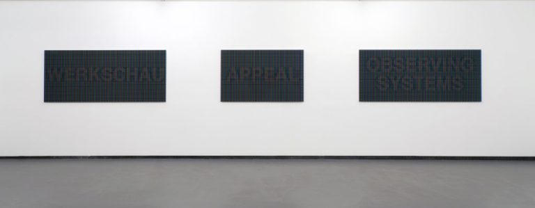
WERKSCHAU has been the title of a series of retrospective exhibitions at FotoGalerie Vienna since 1996. For their 25th anniversary exhibition Günther Selichar was invited to exhibit in November 2020.
At a time when photographs are largely circulated and consumed as JPEGs on digital displays and mobile phones, Selichar’s materialization of large scale photographs via complex stages of production, with high-end reproduction processes and selected materials, give an insight into the image as a multidimensional work.
‘Werkschau is usually translated as ‘retrospective’, but being a composite of the words WORK(WERK) and LOOKING(SCHAUEN), it is also an invitation to engage with images for an introspective gaze, a gaze which is critical and challenging. The term WERKSCHAU is manifested within the exhibition space as macro photography – a digital direct print on acrylic. It forms part of the series of large scale photographic works “NO MEDIA BEYOND THIS POINT”.’
Ruth Horak, art historian and curator, from the artist book accompanying the solo show:
Fotogalerie Wien 2020.
Günther Selichar’s new works are devoted to the phenomenon of perception via mass media, from a scientific, philosophical and artistic point of view. The current series follows a quarter of a century’s work on the relevance of the technological to the perception of mediated content. With a particular interest in the screen and monitor, Selichar considers how these devices have become our main “window on to the world” in contemporary life, a situation highlighted by the current Covid-19 pandemic when we have little alternative but to use these screen based tools.
‘Our media meta-world does not allow us an unobstructed view of “original” events… we are being shown not only our dependence on these machines, but also the necessity to subject these tools and strategies to constant reflection.’
Günther Selichar, interviewed July 2020 for
EIKON – International Magazine for Photography and Media Art #112
Selichar’s deep interest in RGB (the colour model based on Red, Green, and Blue used in electronic devices and digital displays), occupies a central place in his work and process. It requires some understanding of how we actually ‘see’ colour, in order to appreciate more fully what is being represented in his art, and how. Our colour vision is based on 3 types of cone photoreceptor cells in our eyes; those for short wavelengths seen as blue, medium wavelengths seen as green, and long wavelengths seen as red. If all three types of cones are stimulated we see white, and this explains why the colours Red Green and Blue (RGB) are the primary colours of our visual system – each time there is a change in the spectral composition of light arriving in our eyes, we see another colour.
When we talk about colour in the art field, we are more accustomed to pondering the artists’ layering of precious ultramarine over azurite on the Madonna’s cloak for example, or translucent red lake glazes finely ground and carefully applied to warm her flesh tones. The symbolism and the mastery of colour in this sense however, is all about the ‘subtractive’ colour system; the system that depends on the mixing of pigments.
The RGB additive colour system is fundamentally different in that it depends on the synthesis of light, not of pigment. Computer screen and monitor manufacturers make use of the way our brain composes colours from just three different types of signal, in order to effectively trick our brain into seeing colours that are, simply put, not actually there. The optical illusion effect works so perfectly for humans that we hardly realise what is occurring.
‘This essential physiological response to light and colour is essential to additive colour, and has greatly influenced techniques utilized by screen-based mass media, specifically computer graphics and television.’
Kathy Rae Huffman from her 2016 catalogue essay for Günther Selichar:
Who’s Afraid of Blue, Red and Green? (1990–2017)
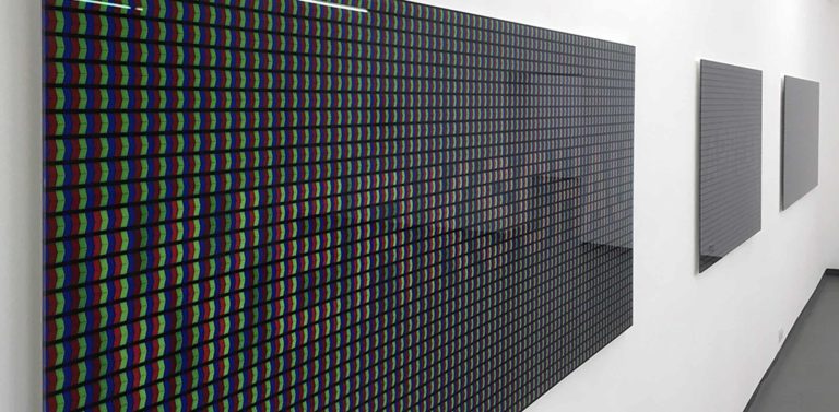
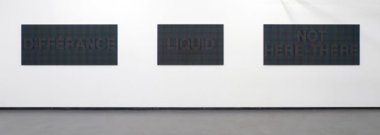
‘With ‘tag’ terms such as OBSERVING SYSTEMS or NOT HERE-THERE and EMBEDDED, Selichar delineates the theoretical framework for his engagement with phenomena relating to mass media. The texts on his large-format images can only be read from a distance of about 5 metres or more. With the viewer’s decreasing distance they disappear into component RGB building blocks, reaching maximum colour intensity at a 50x magnification.’
Ruth Horak, art historian and curator, from the artist book accompanying the solo show:
Fotogalerie Wien 2020.
Selichar’s abstract works allow us the opportunity to focus upon how these new ways of screen based looking and seeing differ. There is of course a certain paradox in presenting an RGB colour text image in print: the artist is giving us a close impression of the RGB colour experience while actually using pigment. There is a translation occurring here from one colour language to another. The printing machine creates images by combining Cyan, Magenta, Yellow, and Black (CMYK) colours to varying degrees with physical ink (subtractive mixing); all colors start as blank white, and each layer of ink reduces the initial brightness to create the preferred color. CMYK refers to primary colours of pigment and the combination of these inks creates black, unlike the combination of RGB light which creates white.
Selichar describes lengthy testing processes on colour profiles with parallel and continuous comparisons to the colours of the screen for his translation of image to print, in order, for example, that blue remain blue (not veering towards violet) and green remains green. It is only through this paradox that these images can become analogue physical artworks for the viewer to interact with. They approximate to their best ability a world which is based on essentially different physical foundations.
‘The RGB triumvirate is, however just one of the many possibilities of preparing images for transfer. Even the rendering of reality in a photograph implies a deconstruction of the image into a heap of silver particles, into pixels, into zeros and ones.’
Ruth Horak, art historian and curator, from the Werkschau XXV Catologue, 2020
The text works are photographed on a screen using a detailed method developed from natural science research, then processed with specially developed software and printed directly on museum standard acrylic in media aspect ratios (16:10, 21: 9) in final formats between 90 x 144 cm and 90 x 210 cm.
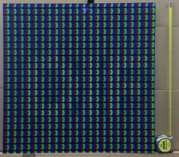
Selichar has been researching and testing for quite some time to find the appropriate material to print upon. To simulate the impression of a computer screen without using any kind of back light or lightbox is not easy, and requires an acrylic with very high light transmittance capacity and clarity. In order to maintain the RGB colour accuracy, UV-protection was needed to minimise colour change over time. Furthermore an anti-reflective surface would reduce light reflections allowing viewers to see the artwork without distracting reflections, contributing to the immersive effect and perceptive colour-field alterations as the viewer steps forth or back. These unframed and delicate works will be shown in many exhibition venues with all the associated risks of multiple packing/unpacking and installation procedures, therefore a museum acrylic with a more robust abrasion resistant surface, was ideal.
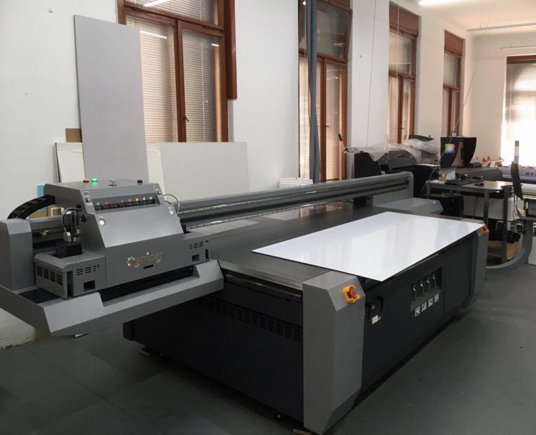
Christian Schepe, a fine art printer based in Linz, Austria, who has worked with the artist Günther Selichar over many years, comments on their search for the perfect media for the new series:
‘Our clients love the depth and high contrast range of direct printing on acrylic. One of the disadvantages however of using a standard acrylic, are the distracting reflections. For Günther Selichar’s project in particular this, together with the loss of chromaticity, would have been problematic. In our search to avoid this we discovered TruLife Acrylic for direct printing, which has an optical coating to reduce reflections down to 1%. Initially we were skeptical about suppressing reflections, but after a test print we were really impressed by the improvement in relation to standard acrylic. In addition, we also noticed the high transmission and the clarity of colours, one of our most prized features, especially in red green and blue. We were delighted with TruLife Acrylic’s performance in the face all those challenges and the result of the finished prints far exceeded our expectations.’
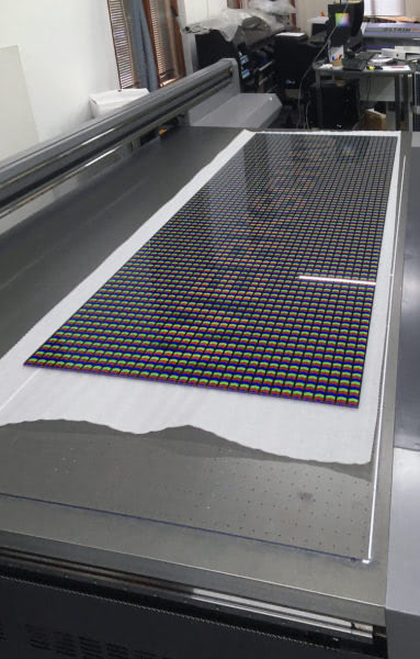
As a conservator, the choice of an artist’s medium, its performance over time and it’s meaning in the context of the making of the work, are always a major part of the discussion. In specific ways Selichar is working with light as his medium, as in a sense we all are, consciously and unconsciously, as artists and as audiences. The way materials interact with light fundamentally affects our perception, and with the very concept and interrogation of perception itself being at the fore in his work, we were delighted Günther Selichar found Tru Vue® TruLife® Acrylic to meet his exacting requirements.
View the FOTOGALERIE WIEN video-interview with Ruth Horak and the artist:
Günther Selichar studied history of art and classical archeology at the University of Salzburg 1979-1986 and at the Art Institute of Chicago (Fulbright Fellowship). From 2007-2013 he was Professor of media arts, mass media research and art in public media space, at the Academy of Visual Arts, Leipzig, since becoming member of the “Advisory Council for Photography” of the Federal Chancellery of Austria 2017-20 and various other commissions and juries. His work has been shown in major galleries and museums in more than 20 countries, and are in numerous international private and public collections worldwide.
About The Author(s)

Alisa Vincentelli
International Museum and Conservation Liaison, Tru Vue
Alisa Vincentelli studied Classics and Archaeology at Queen Mary University of London 1989-1993 and following that a PGDip in the Conservation of Easel Paintings at the Courtauld Institute of Art 1994-1998. From 1999 she worked as a specialist in the conservation of modern and contemporary art before becoming International Museum and Conservation liaison for Tru Vue in 2019.
