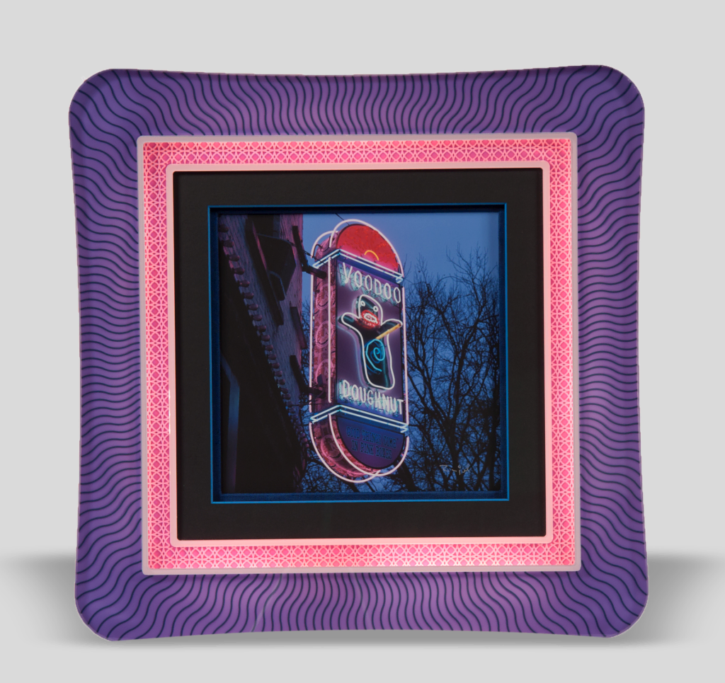
The neon sign at Voodoo Doughnut in Portland, Oregon, beckons hungry Doughnut lovers long into the night. When Donna Erwin of Columbia River Gallery, in nearby Troutdale, had the opportunity to reframe a photograph of the famed sign, she aimed to capture the vibrancy of the iconic landmark with a design that borrowed from its colorful light and imagery that cuts through the city’s darkening skies.
The Moment
Designing a framing package that enhances a piece is one of the great creative challenges of custom framing, where art and craftsmanship converge. For her 2014 Tru Vue® Framing Competition piece— themed Rethink, Renew, Restore, framers were asked to redesign an old framing project. Donna knew just what piece she wanted to recreate. It began with a framing package that was too simple and neutral for a photograph of one of the city’s most recognizable signs. Her redesign used new materials in innovative ways and repurposed old materials within the structure.
The Design
Inspiration came from the neon glow of the sign, as well as a class she had attended on Prisma frames where she discovered the possibilities of integrating LED lighting into the design. Her idea was to use lighting within the frame to bring light outside the boundary of the photo, making it seem as if the neon sign was illuminating the frame. She chose shapes and colors that matched the neon sign — a panel shaped frame in fuchsia with a candy “mosaic” pattern for the inner frame, and a nouveau shape in violet with a midnight blue pattern and pink lip for the outer frame.
Overcoming Challenges
Using the Prisma frames in this way presented some challenges. The frames were not meant to be stacked, and Donna needed to find a place to install the LED light strip. She addressed these issues by using the original frame and resizing it to secure the two Prisma frames together and provide space for the hanging hardware, which was also original. Donna also used the existing white mat board, wrapping it in a royal blue silk remnant to coordinate with the top mat, black with a Britecore blue bevel. This black-and-blue scheme flows into the photograph’s twilight sky, bare trees and shadowed brick buildings.
The piece was glazed with Museum Glass®, which was essential to the design given the lights illuminating the inside of the frame.
Because of the way the lighting was designed, Donna needed an unpainted rabbet for the light to shine through in the right way, so she had to remove the paint from the rabbet. Several rounds of trial-and-error revealed the best way to remove the paint. Precision was important, as an even slightly uneven line would be obvious. Paint thinner was so strong that it ate into the masking tape used to create a straight line and into the frame itself. A Dremel tool was unwieldy for such a precise job. The ultimate solution was using acetone nail polish remover as paint stripper with aluminum masking tape to protect the edge. She removed the paint with a scraper and paper towels in an effort that took 10 hours to complete.
The experimentation and time invested yielded amazing results. Donna’s use of light, color, and shape blur the boundaries between the photograph and the framing package. Thus, resulting in a unique piece that does justice to the subject it celebrates. She was chosen as the Best In Show winner that year, and her piece continues to impress customers on display at her shop.
Share this Article:
This article is intended for educational purposes only and does not replace independent professional judgment. Statements of fact and opinions expressed are those of the author(s) individually and, unless expressly stated to the contrary, are not the opinion or position of Tru Vue or its employees. Tru Vue does not endorse or approve, and assumes no responsibility for, the content, accuracy or completeness of the information presented.
